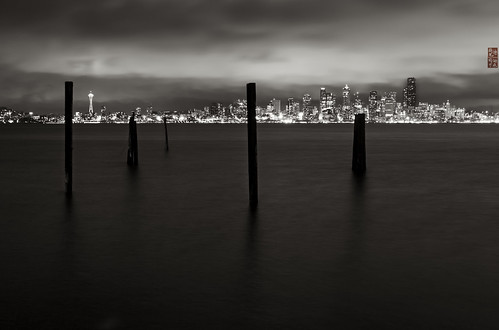
This image was shot specifically as the final image for a portfolio of beachscapes taken around Seattle. I had made an image in these same tripod holes the weekend before during the day and wanted to come back in the evening to catch the cityscape across the bay against the piers in the foreground.
A storm was clearing when this image was made. The light was changing constantly as the low clouds ascended and the rain turned to a light mist. Most of the light here is from sodium arc lights on the the port cranes off to photo right bouncing back and forth between water and sky. Seals were barking nearby, just off shore in front of me.
The image was made with a Canon 5D Mk II and 17-40 f4.0L lens. The focal length was 40mm, and the exposure was made at f5.6 for 8 seconds. The image was processed using Lightroom 3 to do the raw conversion and to correct lens and color issues, then further processed in Photoshop CS 5 and Nik Silver Efx 2 to do the black and white conversion and sharpening. Prints are made on metallic paper.
My goals for this image were to show the city from a well known but frequently dismissed view point, contrasting the verticals and lights of the skyscrapers in the background with the empty and abandoned piers just offshore in this area. The challenging part of the capture was exposing and recovering the fronts and shadows on the foreground side of the peers without letting them go completely black.
Overall, I'm fairly happy with the composition, capture and processing of this image but I look forward to your critiques. Thank you.
Friday, January 20, 2012
Puget Sound XXXII: City

Sunday, April 03, 2011
Oculus

New work posted: Oculus. Split tone exploration of the dome in the Nat'l Gallery of Art in DC with a mystery reflection from somewhere... Spooky...http://bit.ly/g6apaP
Thursday, November 25, 2010

Sunday, November 07, 2010

Thursday, October 28, 2010

Sunday, September 26, 2010
Still LIfe I
I like this image alot; it works better in color than black and white, I think. Color seems to bring out a richness in the colors of the antique wineskin that are difficult to bring out in black and white.

Thursday, September 23, 2010
A fun little outtake taking during the still life shooting I was doing yesterday. I'd been wanting to shoot this little vase filled with cherries but cherry season is long over but cherry tomatoes are ripe and abundant right now.
The black and white version has quite a different feel to it that really differentiates the red and orange tomatoes.

The black and white version has quite a different feel to it that really differentiates the red and orange tomatoes.
End of Summer Dahlias
Continuing with my black and black still life work, these nearly black dahlias seemed like a natural against black seamless. I was pleased with the definition in the deep shadows here as well as with the rather broad tonal range.
Film Profile - modified Agfa 100 film with increased and hardened grain.
Filtered with 50% yellow filter before toning with grey green and brown passes of Platinum toning washes.

Film Profile - modified Agfa 100 film with increased and hardened grain.
Filtered with 50% yellow filter before toning with grey green and brown passes of Platinum toning washes.
Sunday, September 12, 2010
Grass Covers All
A little memoriam for co-workers and other brave souls that died in the 9/11 tragedy. The works of Sandburg's poem "I am The Grass" seemed appropriate in a way both melancholy and hopeful.
At any rate, I tried some new processing techniques here to establish baseline / sea level black and whites. I think they worked pretty well but will require some use and experimentation to make regularly useful.
Composition Note:
I really liked the way this composed up in the view finder. Surprisingly (or maybe not), the way the angles fall on the main left and right blades of grass at the top burst also fall very close to the harmonious golden section diagonals. More interesting is how nicely they line up with the trunk and branches of the tree as well. Fun.
Mother Nature is the first and greatest Geometer, always.
Taken with the f1.4 50mm on the 20D so effective focal length of about 80mm.

At any rate, I tried some new processing techniques here to establish baseline / sea level black and whites. I think they worked pretty well but will require some use and experimentation to make regularly useful.
Composition Note:
I really liked the way this composed up in the view finder. Surprisingly (or maybe not), the way the angles fall on the main left and right blades of grass at the top burst also fall very close to the harmonious golden section diagonals. More interesting is how nicely they line up with the trunk and branches of the tree as well. Fun.
Mother Nature is the first and greatest Geometer, always.
Taken with the f1.4 50mm on the 20D so effective focal length of about 80mm.
Sunday, September 05, 2010

I had my little Panasonic GF-1 with the 20mm (40mm equivalent) f`.7 lens on it and no tripod, so no messing around with wide angle lenses, polarizers, long exposures with very small apertures, or graduated ND filters. Still, I'm fairly happy with this turned out. Took out some boats and buoys in Photoshop to cut down on the distraction in the water. If I had it to do over again, I'd probably have shot with about a 28 to 35mm focal length to get more sky; I'd polarize it and use a true grad ND and a small aperture to get a nice long exposure to even out the texture of the water. Of course then the ducks wouldn't be in focus. One makes the image one can given the tools, the light and the scene one has, I suppose. At any rate, kind of fun.
Thursday, September 02, 2010
Yellow Tuberous Begonia
Found this blossom in one of the hanging baskets at Pickering Farm in Issaquah Washington one evening last month around dusk.
This image was taken with my Panasonic GF-1 and the Leica f1.7 20mm lens (40 mm equivalent on a 35mm format camera). Shooting with this lens is interesting: when the focus is good the image is amazing. Unfortunately I'm still learning the DOF prisms and close focusing distances for the wide apertures on this particular lens, so this image isn't quite all I had hoped it would be in that department.
It's also been a while since I did one of my full on flower portraits so this one took a bit longer than usual to process and still needs a little more work. I'm still working through whether I like substantial sharpening in LR before moving into PS and before the b/w conversion. The jury is still out on that method and this image is a prime example of why: it seems both oversharpened in some areas and somewhat soft in others. The grain seems a bit stronger than usual when sharpening is done in this manner as well. It's hard make a decision based on just this image because of the DOF and close focusing distance issues in the actual RAW file. More testing is needed but, for the moment at least, I'm leaning away from much more than a minimal pass at sharpening in LR at this point.
From a compositional point of view it's a little static. It *feels* like you should turn the image clock-wise ninety degrees but then the light direction gets non-intuitive. For now, I'm leaving a large chunk of negative space off to the right to balance the composition and to give some breathing room to the little buds heading off to the right and bottom.
Still not a bad image at small sizes. I'll be doing a little more work on this image (mainly some dodging and burning) but I'm not sure a rework from the roots up would do much to improve it overall, given the problems with the DOF prism and relative softness at the center of the blossom.

This image was taken with my Panasonic GF-1 and the Leica f1.7 20mm lens (40 mm equivalent on a 35mm format camera). Shooting with this lens is interesting: when the focus is good the image is amazing. Unfortunately I'm still learning the DOF prisms and close focusing distances for the wide apertures on this particular lens, so this image isn't quite all I had hoped it would be in that department.
It's also been a while since I did one of my full on flower portraits so this one took a bit longer than usual to process and still needs a little more work. I'm still working through whether I like substantial sharpening in LR before moving into PS and before the b/w conversion. The jury is still out on that method and this image is a prime example of why: it seems both oversharpened in some areas and somewhat soft in others. The grain seems a bit stronger than usual when sharpening is done in this manner as well. It's hard make a decision based on just this image because of the DOF and close focusing distance issues in the actual RAW file. More testing is needed but, for the moment at least, I'm leaning away from much more than a minimal pass at sharpening in LR at this point.
From a compositional point of view it's a little static. It *feels* like you should turn the image clock-wise ninety degrees but then the light direction gets non-intuitive. For now, I'm leaving a large chunk of negative space off to the right to balance the composition and to give some breathing room to the little buds heading off to the right and bottom.
Still not a bad image at small sizes. I'll be doing a little more work on this image (mainly some dodging and burning) but I'm not sure a rework from the roots up would do much to improve it overall, given the problems with the DOF prism and relative softness at the center of the blossom.
Sunday, August 15, 2010
Suddenly this sort of work feels familiar yet so far away at the same time. I understand this image now - what makes it work and why, what I'd like to do with it and where I'd like to take it. At the same time it feels so far away from my work of just a few months ago. A lot of miles traveled lately - and a lot of energy expended to move out of the familiar and the comfortable. Now my skills need to catch up with my vision again - time to get busy and start learning again and move on from making more of the same sorts of stuff.
This was, I think, some sort of shaft for carrying munitions to the upper floors of the big concrete structure at Fort Worden near Port Angeles, Washington. Now that nearly all the machinery has been pulled out, the windows taken out and the entire structure left open to the air, it's a playground of light and shadow.
Taken during the TME Whidbey Island Workshop 2010.

This was, I think, some sort of shaft for carrying munitions to the upper floors of the big concrete structure at Fort Worden near Port Angeles, Washington. Now that nearly all the machinery has been pulled out, the windows taken out and the entire structure left open to the air, it's a playground of light and shadow.
Taken during the TME Whidbey Island Workshop 2010.
Monday, September 07, 2009
Dahlia III
A fun experiment in lighting and then in cross toning during post processing. I think it turned out pretty well.

Friday, May 22, 2009
This has NOT been the week for technology - I should have stayed in bed and forsworn touching any computers all week long. I had just written a rather longish posting detailing the image taking and processing details when flickr/blogger ate it due to a password snafu created as an unintended consequence earlier in the week. Grrrrrr. I will try to recreate the post again. dtr.
---
This image of a Dogwood tree flower was taken at dusk on 17 May 2009 at Pickering Farm in Issaquah, Washington. It was taken, handheld, using a Canon 5D mk II and a Canon EF 50mm f1.4 lens set up at ISO 250, 1/160 second shutter speed at f2.5. This is a small crop from a much larger image, though this crop was the image pre-visualized when photo was taken.
I had always thought of dogwood flowers as rather slick and plastic but after spending an hour photographing them it's apparent they are really quite nice little studies in petal drapery: ridges, folds, swells and bumps with a ton of very nice wrinkled cotton-y sort of texture. So much for observations while driving.
Processing-wise this image followed a reasonably normal route in Photoshop, beginning with a Layers adjustment layer to bracket the tonal bandwidth, followed by a very slightly downwardly convex Curve layer to bump up the contrast in the low to middle mid-tones.
Next came conversion to black and white using the most excellent Nik SilverEfx (AgEfx) package. That tool has very decent set of film profiles including one for an Agfa ISO 100 black and white film that has a broad and subtle tonal response that the Kodak and Fuji profiles lack. I'm using that profile quite alot these days and this image was no exception. While in the AgEfx package, I also dialed back the exposure about 1.5 stops, and applied a very mild cyan-ish filter to bump the contrast in the upper to middle shadow range. Finally, before exiting, I gently burned the top, bottom and left edges to enhance the vignetting of the blossom.
Emerging from AgEfx tool, another Levels adjustment layer was applied to set the One True Black Point. I didn't see any value in setting a One True White Point because the histogram already extended to the far right end of the range. Next came another curve layer, this one a very mild 'S' shaped to extend the contrast a little bit more.
Toning came next, with a combination of three washes. The first layer was set up as a duotone to echo the colors in a Silver Gel image, though with a very high transparency. The result of this was to just kiss the petal tops with a very, very slight yellowy tint. This was followed by a greenish gray Platinum duotone and a subsequent brownish gray Platinum duotone layers to give substance and tonality to the mid-range and shadow tones. These washes give the final image a very slight tritone look with whites, very very pale yellows in the lower highlights and greenish-brown deep shadows darkening to true black.
As is normally the case, the image was then sharpened in a mild way with the Photoshop Smart Sharpen function, resampled to 72 dpi and reformatted to jpeg for display on the web.
Looking at the image now, I'm relatively pleased by most aspects of it. Compositionally, I wish that the flower petals were less square to the viewer and at more of an angle. This would, perhaps, give the image a bit more energy, though this arrangement, as it sits, has a certain serene quality to it. This shooting angle also preserved that tasty bit of reflected light bouncing off the petals back onto the surfaces of the leaves at the left that would have been lost with a more oblique view. The diagonals and curves of the lower branches also tend to give the eye some natural direction as well. Tradeoffs and more tradeoffs...
As you might expect after so much futzing with toning, the image looks best on a calibrated monitor where the various grays really emerge. I tried about five or so different combinations of tonal washes, including some colder blue gray / Selenium looks to get something new and interesting. Eventually, I wound up with the Ag gel - Pt - Pt sequence. If I were to go back in I think I'd probably ramp the Ag gel wash transparency back slightly more to about 8 or 10%. Novelty, in the form of the Ag gel toning, is coming slowly to my toning preferences.
I'm getting quite happy with the combination of the 5D and the fast 50mm lens. While the near focusing distance is uncomfortably far as yet, I'm having a lot of fun with it and it's contending as a replacement for my beloved 20D / 35mm f3.0 combination.
This image is good enough to be added to one of the Botanical folios on the PacificaPhoto.net site and so prints will be offered for sale from there soon. As always, your comments and criticisms are encouraged. if you do want a print, they are available by contacting me at the email address listed on the PacificaPhoto site.

---
This image of a Dogwood tree flower was taken at dusk on 17 May 2009 at Pickering Farm in Issaquah, Washington. It was taken, handheld, using a Canon 5D mk II and a Canon EF 50mm f1.4 lens set up at ISO 250, 1/160 second shutter speed at f2.5. This is a small crop from a much larger image, though this crop was the image pre-visualized when photo was taken.
I had always thought of dogwood flowers as rather slick and plastic but after spending an hour photographing them it's apparent they are really quite nice little studies in petal drapery: ridges, folds, swells and bumps with a ton of very nice wrinkled cotton-y sort of texture. So much for observations while driving.
Processing-wise this image followed a reasonably normal route in Photoshop, beginning with a Layers adjustment layer to bracket the tonal bandwidth, followed by a very slightly downwardly convex Curve layer to bump up the contrast in the low to middle mid-tones.
Next came conversion to black and white using the most excellent Nik SilverEfx (AgEfx) package. That tool has very decent set of film profiles including one for an Agfa ISO 100 black and white film that has a broad and subtle tonal response that the Kodak and Fuji profiles lack. I'm using that profile quite alot these days and this image was no exception. While in the AgEfx package, I also dialed back the exposure about 1.5 stops, and applied a very mild cyan-ish filter to bump the contrast in the upper to middle shadow range. Finally, before exiting, I gently burned the top, bottom and left edges to enhance the vignetting of the blossom.
Emerging from AgEfx tool, another Levels adjustment layer was applied to set the One True Black Point. I didn't see any value in setting a One True White Point because the histogram already extended to the far right end of the range. Next came another curve layer, this one a very mild 'S' shaped to extend the contrast a little bit more.
Toning came next, with a combination of three washes. The first layer was set up as a duotone to echo the colors in a Silver Gel image, though with a very high transparency. The result of this was to just kiss the petal tops with a very, very slight yellowy tint. This was followed by a greenish gray Platinum duotone and a subsequent brownish gray Platinum duotone layers to give substance and tonality to the mid-range and shadow tones. These washes give the final image a very slight tritone look with whites, very very pale yellows in the lower highlights and greenish-brown deep shadows darkening to true black.
As is normally the case, the image was then sharpened in a mild way with the Photoshop Smart Sharpen function, resampled to 72 dpi and reformatted to jpeg for display on the web.
Looking at the image now, I'm relatively pleased by most aspects of it. Compositionally, I wish that the flower petals were less square to the viewer and at more of an angle. This would, perhaps, give the image a bit more energy, though this arrangement, as it sits, has a certain serene quality to it. This shooting angle also preserved that tasty bit of reflected light bouncing off the petals back onto the surfaces of the leaves at the left that would have been lost with a more oblique view. The diagonals and curves of the lower branches also tend to give the eye some natural direction as well. Tradeoffs and more tradeoffs...
As you might expect after so much futzing with toning, the image looks best on a calibrated monitor where the various grays really emerge. I tried about five or so different combinations of tonal washes, including some colder blue gray / Selenium looks to get something new and interesting. Eventually, I wound up with the Ag gel - Pt - Pt sequence. If I were to go back in I think I'd probably ramp the Ag gel wash transparency back slightly more to about 8 or 10%. Novelty, in the form of the Ag gel toning, is coming slowly to my toning preferences.
I'm getting quite happy with the combination of the 5D and the fast 50mm lens. While the near focusing distance is uncomfortably far as yet, I'm having a lot of fun with it and it's contending as a replacement for my beloved 20D / 35mm f3.0 combination.
This image is good enough to be added to one of the Botanical folios on the PacificaPhoto.net site and so prints will be offered for sale from there soon. As always, your comments and criticisms are encouraged. if you do want a print, they are available by contacting me at the email address listed on the PacificaPhoto site.
Sunday, May 03, 2009

Sunday, April 26, 2009

Saturday, April 04, 2009

Saturday, March 21, 2009
Curls and Textures
This is a reworked image from the archives. Originally take on April 14, 2007 at the Conservatory of Flowers in Golden Gate State Park, San Francisco, California.
The flower was a sort of pinkish coral orange (to my eyes) on a fairly dark green leafy background. My origiinal visualization of the black and white version of this image was to highlight the curl of the petal as well as the diamond mesh texture on the rather extravagant corkscrew by giving them an isolation and careful enhancement of the tonal values in the mids and upper highlights.
As far as processing goes, I began by increasing the vibrance of the raw image before jumping into Photoshop. Next I cropped the image down from the much larger initial photo to set up the composition and concentrate attention on the flower itself. After relatively standard application of Levels and Curves, I used Nik Silver Effects to do the black and white conversion. Within the Nik AgEfx package, I used a very mild pale blue filter to give a bit more contrast to the image, and an Ilford ISO 50 black and white film profile to get a good contrasty tonal range. I also decreased the grain size a bit to keep it from interfering with with fine texture on the cork screw.
After exiting Nik, I applied another Level layer, using my now standard Threshold layer technique to find and set up final light and dark endpoints on the Level histogram. Even still, the lightest part of the petal texture was a bit blown out by about a quarter or third stop, so I selected just that area using the color range selector and then a downward bowed Curve layer to bring down the brightness for those areas just a bit.
Next came burning and dodging to darken a few of the brighter specular leaf highlights in the background and to put a bit of a vignette around the main body of the flower. Instead of the default Photoshop burn and dodge tools, I use the rather more controllable method of overlaying the image with a new layer blended with soft light, and filled with the 50% neutral tone. Then using pure black and white as the foreground and background, (switching as required), and using a soft edged, nearly transparent paintbrush, one can darken or lighten in a gentle, slow, and very controllabe manner.
I'm pretty happy with this image - it's eye catching and the contrast between the rather hard curves of the cork screw and the soft roll of the petal are well differentiated. The goal of showing off the texture difference was fairly straight-forward to achieve though processing, though this didn't occur until the sharpening step. I had hoped to be able to highlight the little white pollen grains on the end of the corkscrew and that too turned out to be relatively easy to do just by watching the levels endpoints in the final levels layer. The bokeh also turned out quite well too.
The only thing I'm mildly chapped about in this image is that depth of field is not quite perfect. Shooting at f3.2, the back of the corkscrew is a little bit out of focus; an f-stop of 3.6 or 4.0 might have been better to get it all in perfect focus yet still isolated from the background.

The flower was a sort of pinkish coral orange (to my eyes) on a fairly dark green leafy background. My origiinal visualization of the black and white version of this image was to highlight the curl of the petal as well as the diamond mesh texture on the rather extravagant corkscrew by giving them an isolation and careful enhancement of the tonal values in the mids and upper highlights.
As far as processing goes, I began by increasing the vibrance of the raw image before jumping into Photoshop. Next I cropped the image down from the much larger initial photo to set up the composition and concentrate attention on the flower itself. After relatively standard application of Levels and Curves, I used Nik Silver Effects to do the black and white conversion. Within the Nik AgEfx package, I used a very mild pale blue filter to give a bit more contrast to the image, and an Ilford ISO 50 black and white film profile to get a good contrasty tonal range. I also decreased the grain size a bit to keep it from interfering with with fine texture on the cork screw.
After exiting Nik, I applied another Level layer, using my now standard Threshold layer technique to find and set up final light and dark endpoints on the Level histogram. Even still, the lightest part of the petal texture was a bit blown out by about a quarter or third stop, so I selected just that area using the color range selector and then a downward bowed Curve layer to bring down the brightness for those areas just a bit.
Next came burning and dodging to darken a few of the brighter specular leaf highlights in the background and to put a bit of a vignette around the main body of the flower. Instead of the default Photoshop burn and dodge tools, I use the rather more controllable method of overlaying the image with a new layer blended with soft light, and filled with the 50% neutral tone. Then using pure black and white as the foreground and background, (switching as required), and using a soft edged, nearly transparent paintbrush, one can darken or lighten in a gentle, slow, and very controllabe manner.
I'm pretty happy with this image - it's eye catching and the contrast between the rather hard curves of the cork screw and the soft roll of the petal are well differentiated. The goal of showing off the texture difference was fairly straight-forward to achieve though processing, though this didn't occur until the sharpening step. I had hoped to be able to highlight the little white pollen grains on the end of the corkscrew and that too turned out to be relatively easy to do just by watching the levels endpoints in the final levels layer. The bokeh also turned out quite well too.
The only thing I'm mildly chapped about in this image is that depth of field is not quite perfect. Shooting at f3.2, the back of the corkscrew is a little bit out of focus; an f-stop of 3.6 or 4.0 might have been better to get it all in perfect focus yet still isolated from the background.
Tuesday, March 10, 2009
Tulips (Detail)
A rather fun shot of some yellow tulips.
This particular image is a crop from a larger image shot. The lighting is all natural and provided by the sun bouncing off of snow (yes snow in in Issaquah mid March!) to provide uplights off the ground and off of snow covered trees in the background to profide back lighting.
I like this image for so many reason - there is a lot of scale here - from the really delicate ridging and veination of the petals, to the larger geometrics of the flower petals, cups, stems and leaves with lots in between as well. I also like the delicate illumination on the bottom of the flowers providing a rather interesting contrast to the stronger translucent qualities at the top of the petals. The oddly delinquent petal off on the right and the swirl pattern of it's veins really makes the whole shot and keeps it from being just another shot of spring tulips.
Camera wise, the 5D mkII is simply a dream tool for me. This image was taken with an older mark I version of the famous Canon 'nifty fifty' EF 50mm f1.8 lens. There is just so much more of a smooth color gradient available for processing here especially in a 16 byte color space that it's just like playing in butter compared to the range provided by my old reliable Canon 20D.
Processing wise, I went through a series of sketches with this image, looking at Titanium, Titanium-Platinum, and Platinum-Platinum tri-tones before finally settling on the Pt-Pt toning.
The usual adjustment steps of level & curves were followed by conversion to black and white using Nik Silver Efx. Increasingly, I am using an ISO 100 Agfa black and white film simulator. I find it gives me a nice grain and a wide tonal range with which to work. Similar speed films from Kodak produce much darker tones with fewer highlights while those from Fuji and Ilford tend to lighten things up at the expense of richness in the mid-darks.
After conversion to B/W, another round of curves and levels were applied to tweak things back into shape a bit followed by the double Platinum toning steps. Finally, a last bit of spotting and some sharpening (Smart Sharpening, radius, 1.1, value =30) and conversion to jpg were done to produce the final image.
My only issue with this image is the grain - I wish that I had been able to shoot it at lower initial ISO. However for a handheld grab shot it's not too terrible.
As always, comments and critiques are welcomed.

This particular image is a crop from a larger image shot. The lighting is all natural and provided by the sun bouncing off of snow (yes snow in in Issaquah mid March!) to provide uplights off the ground and off of snow covered trees in the background to profide back lighting.
I like this image for so many reason - there is a lot of scale here - from the really delicate ridging and veination of the petals, to the larger geometrics of the flower petals, cups, stems and leaves with lots in between as well. I also like the delicate illumination on the bottom of the flowers providing a rather interesting contrast to the stronger translucent qualities at the top of the petals. The oddly delinquent petal off on the right and the swirl pattern of it's veins really makes the whole shot and keeps it from being just another shot of spring tulips.
Camera wise, the 5D mkII is simply a dream tool for me. This image was taken with an older mark I version of the famous Canon 'nifty fifty' EF 50mm f1.8 lens. There is just so much more of a smooth color gradient available for processing here especially in a 16 byte color space that it's just like playing in butter compared to the range provided by my old reliable Canon 20D.
Processing wise, I went through a series of sketches with this image, looking at Titanium, Titanium-Platinum, and Platinum-Platinum tri-tones before finally settling on the Pt-Pt toning.
The usual adjustment steps of level & curves were followed by conversion to black and white using Nik Silver Efx. Increasingly, I am using an ISO 100 Agfa black and white film simulator. I find it gives me a nice grain and a wide tonal range with which to work. Similar speed films from Kodak produce much darker tones with fewer highlights while those from Fuji and Ilford tend to lighten things up at the expense of richness in the mid-darks.
After conversion to B/W, another round of curves and levels were applied to tweak things back into shape a bit followed by the double Platinum toning steps. Finally, a last bit of spotting and some sharpening (Smart Sharpening, radius, 1.1, value =30) and conversion to jpg were done to produce the final image.
My only issue with this image is the grain - I wish that I had been able to shoot it at lower initial ISO. However for a handheld grab shot it's not too terrible.
As always, comments and critiques are welcomed.
Wednesday, February 25, 2009
Cold Trees
Another from the Swiss archives, though a square crop from another image. I like the contrast of the tree shapes with the planar mountain form behind. The light brown grey Titanium toning works well for the entire image and I think gives it feeling of cold and winter.
This was definitely one of those "channeling Mr. Adams" sorts of images, turning out pretty much exactly as I had visualized it when I took it.

This was definitely one of those "channeling Mr. Adams" sorts of images, turning out pretty much exactly as I had visualized it when I took it.
Subscribe to:
Posts (Atom)

